Inspired by the mammoth success of my post from last night, here are a couple more little things I’ve picked up along the way. Both are much simpler.
» Good corners
This doesn’t really apply much anymore, but in the HL1 days this was one of my favourite little things. It’s so simple and boring that it’s brilliant.
I never liked the borders that were often put on the corners of platforms and floors and ceilings and other stuff. They never looked neat, because of the varying thickness of the outline. Of course something so small doesn’t really matter, but it did bother me. Typically, borders would use the the left or right layouts in the image below. My preferred way is the middle one.
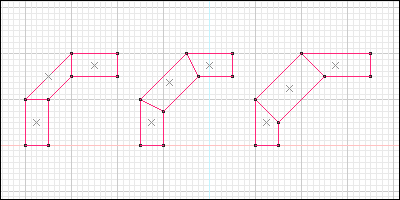
That’s it. Do the middle one. That’s as exciting as it gets.
» Rotating things perfectly
This trick is however very handy and quite cool. Using the same technique as in my tip yesterday, you can use brushes to restrict the motion of groups of entities to certain bounds. The key thing is that this also works for rotation. Consider this:
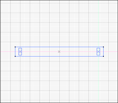
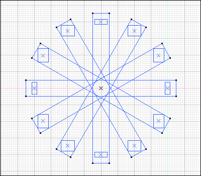
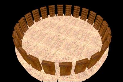
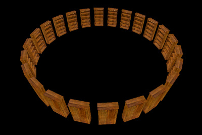
In the last two images I’ve added even more rotations, but you can see the basic principle. The fantastic thing here is that everything is in the absolute perfect location, and of perfect rotation too. It let’s you create things like the skylights in the middle of the hallway in the CS:S version of Dust, as well as stairs and all sorts. It’s particularly useful when you want to rotate something around a point that is not its origin - just create a brush surrounding it, such that it’s origin is at the intended centre of rotation.
It can be manipulated a bit too - offset the brushes and you can create some weird but perfectly aligned patterns, like this:
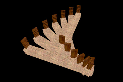
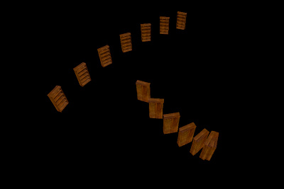
Of course, that’s a silly example, but the concept is there.