Sometimes, I can’t help but see something on TV and want to recreate it as a CS map. A few seconds thought and suddenly I’ll be visualising what something would look like once all mapped out, textured and populated for Counter-Strike. It happened again this weekend whilst watching Spooks.
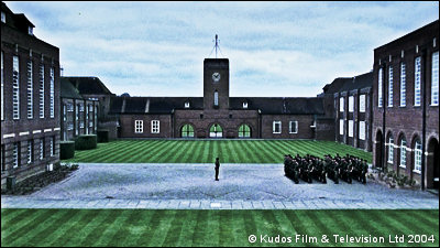
The area below caught my eye:

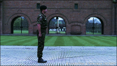
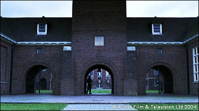
I have absolutely no idea what this place is in real-life, but in this episode it was an army barracks. The buildings are fantastically English, apparently drab and dull (maybe it’s the overcast sky) but simple and very flexible. I’ve always wanted to do a map in this architectural style, but the problem is that it always seems so monotonous in-game.
The immediate idea when seeing something like this - with these absolutely courtyards - is first to think of ‘landmark’ and then onto ‘bomb target in the middle.’ The problem is that these courtyards are a huge a 50m (or more) square of flat nothingness. Large flat expanses like this never work well in CS, particularly not as a focal point of the gameplay. CS players don’t like to expose themselves if at all possible, so this wouldn’t work.

This problem can however be turned around. Make the courtyard an optional shortcut between areas, and suddenly the player has to balance risk with opportunity. This style of architecture has wide corridors in the perimeter buildings - these would be the major gameplay paths - and the courtyard would simply offer the opportunity to save some time or get a better sight of the enemy. The courtyards essentially become as dangerous as the Dust’s T-junctions - get caught out and you’re toast.
With this in mind, the map would share more in common with corridors gameplay, but with many opportunities to escape the boringness of corridor maps due to the large expanses.

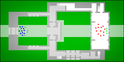
My idea considered the Terrorists starting in a large first-floor hall/room above the entrance to the primary courtyard, with the tall stained windows bathing the room in bright sunlight to give it a ‘warm’ feel (this is important to keep the Terrorists feeling ‘safe’ and encourage them to guard hostages.) The windows would (naturally) give the Terrorists an excellent view of the courtyard and hence some glimpses of the CTs.
This sort of scenario balances itself. A few windows offering a good view to a large area seem the obvious place for a sniper to camp and take potshots at everyone, but conversely, the fact there are only a few windows means an enemy sniper knows exactly where to look.

So, Terrorists have a perfect little nest. It’s big, open, airy, and gives them a good view of the main courtyard. Meanwhile, CTs have to take the perimeter buildings, taking corridors and darting through hallways, sometimes opening back out into the courtyard. It’s all very simple.
Unfortunately, it’s not all that exciting. The first few times, sure, maybe… but it’s hard to see the replayability in it. It is essentially a figure-of-eight routemap (remember the two courtyards in each loop of the figure), with the CTs just navigating corridors for a large proportion of the map. Make it symmetrical (as in my example) and it becomes even more tedious.
There are ways to spice this sort of thing up - make the routes quite open, add lots of furniture to the areas, a dash of supporting buildings and alternative ways to reach the hostages - but those don’t come just yet. I’d get the base plan down in Hammer, and then work out from the geometry the best way to make the map a little less symmetric and give both teams a little more to play and experiment with. That’s the key: they should never have to play one round exactly the same as the one before it. Looking at the layout here, that just won’t happen without another draft or two.
That all said, I’m still a little tempted. Just a little.
Bah.