Off we go again! Not too cruel this time, focusing on theme, style and architecture.
Mikael ‘I have no’ Surname
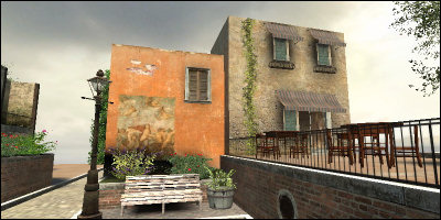
This is an interesting one, mostly because I think it represents the stage that a lot of mappers find themselves at: they know the tools, and they have a good idea of what they want to have at the end, but the bit inbetween is where it all goes pearshape. Judging from the filenames given to these screenshots (‘italy2’), Mikael has taken it upon himself to create a successor to Italy.
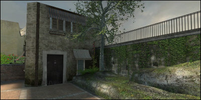
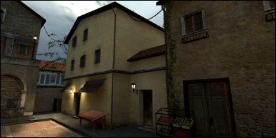
Clearly only a small section of map has been created, but effort has been focused on trying to get the right theme and environment; many of the details of the map so far would normally indicate near-completion. The problem here seems to be that the appearance just isn’t coming together.
A big issue is getting the buildings right. Right now, despite their doors, windows and balconies, they look dull and uninspired, almost carved out of concrete. This isn’t helped by the dodgy lighting around the props. Most noticably, the buildings lack a sense of construction. Even just adding roofs would be a huge step in the right direction.
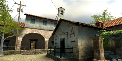
Best bet here is to load up CS:S, load up Italy, and run around manically taking screenshots, a bit like this one:
That is one of the simplest buildings in the map, but it looks pretty convincing. First of all it has a roof, smattering of windows, and a tall ground-floor. Also, there is paving all around, acting like a plinthe and cementing its position in the environment. The building isn’t just a square box with windows. Inferno is also an excellent resource, and takes things one step further.
The key here is really to look at how other maps are built. For any game, it’s worth trying to replicate areas that you like simply to get a feel for how they’re put together and the components they use. Usually, there are a few surprises…
Once you’ve worked out how to build the environment, then you can actually start building it. When you’re adopting an existing texture set, style and theme, it makes it even easier!
Justin ‘filmz4evar’ Tomchuk
Justin says, “Mapping is a fun hobby for me. I had to cancel my project though, because it was taking too much time out of my life and away from my other hobby of filmmaking.” Which is a shame, because it looks like the willingness is there.
It’s not very Counter-Strikey, mind…
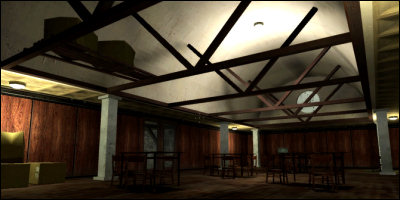
Again, much like Mikael, these maps seem to be stuck in a state of knowing where they want to go, but not quite making it. However these are stage further - the essence of architecure is there, but the realism isn’t. The world seems quite simple and cartoonish due to the proportions and mixing of styles.
The screenshot above shows this in a couple of places. Firstly, the roof beams look a little weak for holding up what looks like plaster-covered brick. They should probably be chunkier and more sporadic. Secondly the white square pillars look out of place - in a room with wooden roof beams I’d expect most of the supporting structures to be constructed of wood also.
The room also seems to lack purpose - it feels like an empty hall that someone lost some chairs and tables in. Someone’s post is on the far left. For some reason, the lighting engineer chose to light the side walls and ceiling rather than the practical area. I imagine they were probably inebriated at the time. Or had just been fired. Or one because of the other. I don’t know.
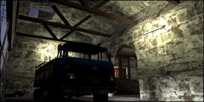
There are similar issues here, but the big problem is the architecture. Firstly, we’ve got wooden beams holding up a room that appears constructed of stone. The stone roof is incredibly thin, and to top of off, they carved perfect squares out of the stone to add modern glass windows. You can also see in the archway how thin the walls are. It’s a bizarre mixture of themes and concepts. There’s also flourescent and environment lighting both struggling to light the same room. (Probably that bloody lighting engineer again.)
This is really something learnt with experience and a little common sense. Stone walls are usually very thick, wood walls fairly thin. Wood supports are generally quite thick, and metal supports generally girdered (not solid metal!). Supporting pillars are rarely made of stone. It’s case of matching the material with a purpose and considering how they work in the real world.
However, the screenshots otherwise show a good environment, one that is starting to have purpose and sense of existence; not just room-corridor-room-corridor-room. This is good! Keep going!
Lord uNsaIN The First
uNsaIN works on mod Off-Limits and sent me a few pics of ‘ol_bunker’. Not the most original name for a map…
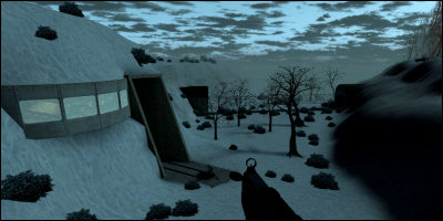
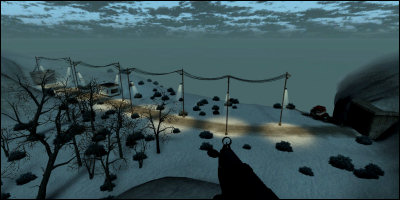
This is probably the most representative shot of the theme uNsaIN is going for - snowy, cold, dark and big. The map appears to be based around a large bunker (presumably) buried underground. Underground bunkers have always been popular targets for mappers, which makes this one of the better ones.
There are immediately a few issues here. Primarily, there is no distinction in the formation of the rock - it seems to vary in curvature and is all covered in thick, rippled snow. I would expect the side of the rock (where the windows and entrance have been carved in) to show rock, not snow, even as just an indication of the playable area. It really calls for a wider use of textures to convey a location.
Secondly, the small bushes dotted everywhere (randomly) are distracting. Ideally these would be placed individually and (like in real life) would naturally be found in bunches. I’d expect to find a lot around the trees, for example, and very few near the opening of the tunnel. Botanicals like this can add a lot to the environment when used right, and are great for using as cover in large open areas.
The tunnel entrance is made of very thin concrete, and much like some of Justin’s architecture, is unconvincing. Concrete in that scenario would need to be a lot thicker to hold the weight of the rock. It’s uniformity is also rather dull - it says ‘hole’ rather than ‘entrance.’
The same issues repeat themselves. I’m not sure if the entire area shown is playable (I’m guessing not), but if it is, some additional cover wouldn’t go amiss either.
This time we have streetlights. Personally I wouldn’t expect so many streetlights (and so many wires) on both sides of a small road over such a short distance. The section of road could probably do with only 3 or maybe 4 ‘streetlight’-style lights in total. I would also focus giving the tunnel entrances and the small hut much more noticable lighting.
The environment lighting also needs a little tweaking, although it’s got a very good start. I learnt from MacMan that lighting (when doing a snowy version of Dust) when you’ve got snow around is hard to do, because it causes the light to bounce a lot; you rarely get dark/black patches. However, these two screenshots both show very distinct dark patches which is surprising considering the lightness of the sky. I’d say the ambience needs to taken up quite a bit and the sunlight decreased. Shadows shouldn’t be so clear outside in those conditions.
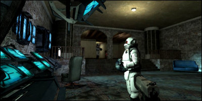
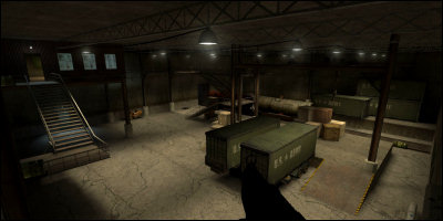
Finally, an indoor bit! This is looking pretty good. Immediately the ground texture jumps out as being a little too repetitive - a ‘flatter’ texture would work a lot better. I would also consider adding some cover near the base of the stairs, and also some stair supports (or the two could be combined.) The lighting is a bit uniform, simply breaking a few of the lights to create some darker patches would help a lot.
It still pains me to see such a large empty area. I would try to duplicate some of the lowered section (with the tanker) around here, to give it some variety and pull the staircase into play. Maybe giving the player access to the rafters could be fun. The ceiling too looks plain - more variation like arcing, destroying, cutting out or even lowering some bits would help break it up. It’s important to give an area like this a sense of purpose, and give its siblings (like the raised room on the left) some sort of personality too. The key is to make sure that they seem as alive as they are important to the gameplay.
Nonetheless, for another bunker map it’s certainly pretty huge and still rolling. It’s in the ideal state to make big changes and consider the overall flow.
Apologies
This is where I apologise for not being meaner. I just couldn’t bring myself to do it, and for this I blame Chuck Wilson. That blastard. More next time.
