Another two this week. I keep writing too much!
Sylvain ‘something something’ Douce
This is an odd one. This is partly because it’s a map for Warsow, a game I’ve never heard of, and partly because said game is a ‘fast paced FPS game’ based on Quake 2, which I have heard of. Hell, I mapped for Q2 for years before HL1 arrived. It was brill. Very different to both HL and CS, mind…
Warsow is quite different, apparently. It involves lots of bouncing and hence makes much better use of the z-axis than you traditional CS bunny-hopper (which really is saying something.) It’s not my forte at all, I haven’t played the game, and I’ve only got a few pics of the map… which pretty much makes anything I say even less valuable than before, so I’m going to make all kinds of crazy comments and accusations…
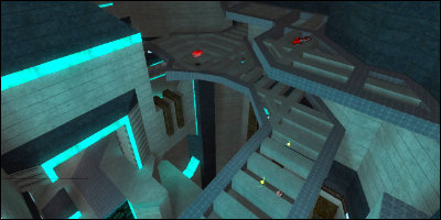
The screenshot tells us two things: this map is very blue, uses no more than a handful of textures, and likes to show off it’s heritage. It’s very Q2-like. Because of this I’m going to ignore Q2’s dodgy surface lighting (notice the non-uniform uplighting) and only say that I think the lighting needs some more variety. I think.
If it really is a fast paced FPS, then you have to give the player bigger hints than you would in a game like CS. Players only really care about weapons and other players, so you take a leaf from Quake games and make weapons stand out with spotlights, small, elevated platforms and things like that. It’s not insulting the player’s intelligence if the game is meant to be a mindless romp anyway. Probably.
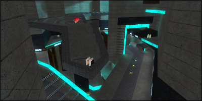
Above, a different angle of the same area. It shows that the armour (?) in the middle is actually on a lowered platform, so it does have some significance, but it still seems a bit lacking. The area also seems a bit cluttered; I can’t help but think trying to use the z-axis would result in a lot of bumped heads, maybe.
I do like the the mixture of angles though, and the strip of carpet to lead the player around. I always found that with DM maps, especially one which has several fairly well-defined ‘floors’ like this one, you have to make sure of a few things. Firstly, the higher the player is, the more likely there is a ‘circuit’ they can take which will keep them on the move without having to drop any lower. Secondly, the lower the player is, the easier it has to be to find a way up. Thirdly, high-value items are either at the very bottom, or at the very top on a floor that has no ‘circuit’ and encourages them to drop down to the next lowest level. Players want to keep moving and get as high as possible so they have an advantage. As designers our job is to help them do this and offer them encouragement to go down. The player gets to decide what they’re going to do, I say.
This considerations also affect how the map looks. If I spawn (probably in the lower half of the map), I’d expect to know immediately how high up I am simply by looking at the decor and style of the area I’m in. Quake 2 maps typically got dirtier and greener (or cleaner and bluer, or hotter and orangier) as you got lower, which was always a good indication. It not only helps me get my bearings, but gives the map more life and often helps it look better too. The lighting is clearly there, it just needs to be used a bit better, perhaps.
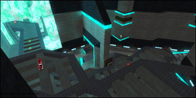
This is when I mention how ugly that big block of glowing crystaline stuff is (if it were a more natural formation it might be passable) and how the gaps in the platforms disturb me.
Just to reiterate: the big block of glowing crystaline stuff is ugly! I’m not sure what it’s for, but it’s very harsh and out-of-place. I don’t know the background though so I’d only suggest trying to merge it in with the rest of the environment, just some sort of nicer, more natural transition. The harsh, rectangular border it opens up with makes me cry like a little girl. A moderately sad one. Only a bit suicidal.
I’m also unsure of the ‘struts’ that platforms have; the strange horizontal bars they’re made out of. Unique, yes, but they seem a bit ‘airy’ to me, a bit simple and cumbersome. They highlight how the map was made (brushes!) when really a map should try to hide this. What’s wrong with a good, flat, normal floor? I’d most likely opt for something much simpler and use the saved polygons elsewhere.
Then again, take all of this with a huge grain of salt because these days I’m used to next-gen engines, single-floor maps and much slower shooters. How fortunate, therefore, that I qualified everything I said with a ‘maybe’ or something. I’m effectively off the hook. Fantastic.
Mark ‘veNoM sNaKe’ Verkerk
Mark says:
my name is Mark “veNoM sNaKe” Verkerk, currently 16 years and im a great fan of mapping, i’ve now been level designing for 5 to 6 years but i think im still missing the edge. I hope you could give me some proffesional crits abaut one of my maps.
personally I am aiming at becoming a proffesional level designer myselve, tough due to my age and current knowledge in mapping I still have a long way to go. well anyhow here are the screens.
This is quite close to my heart, partly because I remember being in the exact same position as Mark. I was 16 when I released ETC, and ETC got me 2 or 3 potential job offers. These days it’s a lot tougher, but Mark is definitely on the right track.
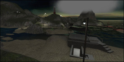
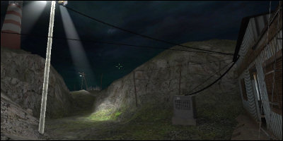
The above screenshot gives the best overview of a small area of the map, showing it is essentially a small island, with wide-open areas. The grey smoke is supposed to be smoke from the volcano.
The displacement map is pretty good, and its texturing is alright as well. The dotted lights help break it up. The concrete structure (bottom right) is ok. By themselves, they are all pretty good. However, they don’t really fit together as a whole. The concrete structure appears to go straight into the ground, very tidily, which looks very odd to me. I would not mix something very man-made (concrete) with something so natural (sand.) An underground section would work better if mostly naturally-formed, but supported by man-made materials. Also, a tunnel like that would quickly become flooded, so chances are it would be raised off the ground or boxed in with some medium-height walls (to keep the sea out.)
The lighting also needs tweaking. The ambience should be a lot bluer (it seems to be grey right now, try to match it to the skybox) and the sunlight (which probably will be grey) should help bring out the shape of the geometry. This will give the map a much more convincing night look to it. It would be worth looking at a few maps set at night-time to work out how they do it (or where they go wrong.)
The second screenshot (above) brings up similar issues to before. Why is there an industrial flourescent floodlight planted straight into rock on this island? I would expect a much smaller incadescent light, held up much less securely but offering just enough light to the area. It would also complement the lighting much more (remember, incadescent lights at night time look warm.)
The little hut on the right looks quite good though; shabby and dirty, but not unexpected. In a map like this, buildings like that will generally attract the player, much like beacons. As a designer, we have to expect (and use) this to help make the map fun.
The textring of the rock is also a bit unconvincing, a blend between grass and gravel. An island would be made of a much coarser rock, and wouldn’t be as curved and bubbly as it appears here. Again, it’s worth looking at the rocky/mountainous levels of HL2 (the area around the antlion boss is probably a good reference) to pick up a good set of textures to use and work out how the rock was done in those.
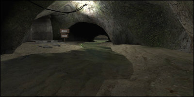
I like this screenshot more than the others, I’m not sure why, although it feels safer and more exciting. Similar issues to before; a mix of concrete and natural formations, and the ripples in the sand underneath the water look out of place. However, this small junction would look terrific with a little redesign taking these into account. Underground bits like this are great fun.
Mark mentions the entire island is navigable, which sounds impressive, but also has huge risks and gameplay implications. Keeping such a vast area running quickly is difficult, especially for a multiplayer map like this where you could feasibly see absolutely everyone else on the server. The best ‘wide open’ multiplayer maps are often actually fairly enclosed, but they ‘feel’ open because of the way they’re designed and the way they draw the player. Take for example the Port or Compound maps in CS:S, both feel (and look) very open but can be broken down into many smaller components. The same should apply here. Even huge Battlefield maps can be componentised into small sections, allowing the gameplay and framerate to be managed and controlled.
It would definitely be worth determining what the basic layout of the map is, work forward from to determine how to simplify the maps geometry, which therefore work out the areas to focus on. Mark has all the skills, and clearly knows how to use the tools, but it really is just a case of being much harsher and more stringent. Comparisons to existing maps which share similar features is an excellent way to work out what to do next or how the existing map can be improved.
Overall though, it’s looking very good indeed. Get a couple of good maps out and the jobs will come knocking.
