‘Cruelness’ has returned, but with a slight lisp. Today’s casualty: de_strata
Kevin Anderson (The Wiser)
Kev The Wiser’s original attempt to overthrow Dust was documented on April 18th. In the following 4 (FOUR?!!) months the cretin ignored my layout advice, and instead focussed on making the map look like a cheap clone of that ‘Nuke’ map I keep on hearing about.
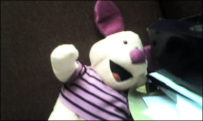
Kev The Wiser has taken a lot of inspiration from Nuke, as far as the style, texture set, lighting, and design. Unfortunately, because Kev The Wiser created an overview screenshot with the vertical as the major axis, posting it below in a convenient widescreen rectangle thumbnail (like everything else) would have looked out of place. To rectify this, I have replaced the thumbnail with a picture of a piglet I stole from Flickr. Ha!
As we can see, he totally ignored my brilliant suggestions for a layout change: “through blind faith in my own design and perhaps a dash of laziness at the prospect of reworking the map on any major level.” Perhaps he doubts my abilities, or my skill as a level designer, or my skill as a very fine cook of pre-packed microwavable Indian curries. This just makes him all the more foolish.
The middle section still feels a bit enclosed and ‘corridor-ey’ to me, but I think he’s slightly alleviated it from how it was before. I’m not a fan of areas quite that enclosed and winding in a centre of a map unless it’s very easy to get to a larger ‘safer’ area very quickly indeed. I believe CS players should always know roughly where to go to find safety, and it’s not very apparent here.
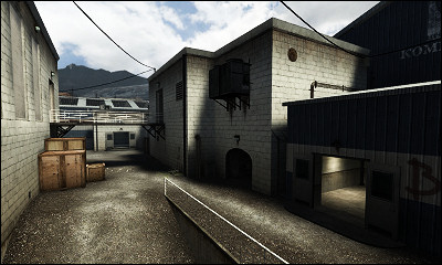
Originally I suggested the bridge was “purposeless” and suggested a range of changes. Thoughtfully, Kev The Wiser took my criticisms onboard and ignored them all… except for the ‘curved building’ bit - he fixed that:
I still think the walkway is out of place, but with all the decoration it does look much better. What annoy me now are the big brown “OMGIMACRATE” crates, the strange curved step into the blue building on the right, and the lack of other height variation. I would be extremely tempted to put just a simple window where the AC units are, overlooking this area, but probably end up removing them by saying they’re “purposeless”, “out of place” or something equally stupid… Oh, there’s one behind the camera. That’ll do.
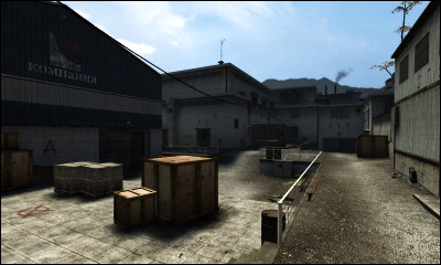
This is bomb-spot A, which is a pretty classy title for a rather classical bomb spot - a little height variation and some cover. All that cover is very important in a bomb-spot like this, due to its vulnerability to so many possible attacks. But why crates? Something could have been made of using those power regulator-type big metallic boxes you see in the distance, putting them here instead. Or maybe moving the bomb spot to where they are (although that would a bit tight.) It is nice to see however that most of the crates and barrels have been paired-up. How very romantic.
Now for the very cruel bit. I don’t usually play BSPs people send to me; being the grandmaster of level design, I have nothing to learn, and merely everything to criticise. Kev the Wiser decided to send me a link to one, perhaps in the belief I would never try it out… but I did. I found the bits he didn’t want me to see.
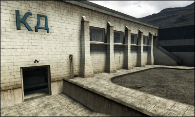
This is bad. No brick structure would have window pillars like those (with the tilted outward base.) This is a big “no” in my book. Secondly, this area is extremely dull, which is quite a contrast to the rest of the level. Fortunately, it is the Terrorist starting area, so they’ll be out there pretty quick, but as the first thing to see every time you spawn, it’s something I’d expect in a far less attractive map. There’s also a bit of trim-itis, and the building is called “Ka.”
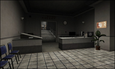
I also don’t like this. This is the main route from the Terrorist start towards the walkway. Look how narrow it is. The hallway’s narrowness I can understand, but the reception table is something I’d wish (as a player) wasn’t there, and as a designer, I’d fear players getting snagged on it. It’s an unnecessary obstacle, especially so close to a spawn area.
So, to wrap things up: de_strata (beta 2, anyway) is (mostly) a very nice map. It feels a lot better than most amateur maps I’ve played, and although it still has an itch of corridoritis (not too clear from the overview), it also has lots of fun things and aspects about it (like windows between passageways and lots of natural cover and room for maneouvre in the interiors.) It also has a full soundscape and looks very good indeed. My main problem with it is that it lacks a certain defining ‘something’ (perhaps because Nuke got there first), but it does a lot of things right and in a very traditional CS defusion-map style (here are some additional parenthesis just to be excessive). My main worry lies with the lack of stuffed piglets.
Kev the Wiser ignored my advice at his peril, and look at the mess we ended up with: clearly an utter disaster of Biblical proportions with absolutely no redeeming factors at all or something. It doesn’t even have any alliteration in its title. Take heed.
