Ok, this one’s a bit mean…
Lord uNsaIN The Second
I first annoyed uNsaIN on April 24th, where I said his map ‘ol_bunker’ had an unoriginal name and was “another bunker map.” I stand by this.
You see, not a lot has changed. Sure, it’s a little nicer looking - the crazy slug-like bushes have been removed - but it still reminds me of John Major; grey and dull.
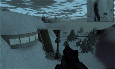
This bit hasn’t changed much at all. The trees have changed, and there’s a big missile sitting there now, but it still has the original problems such as the remarkably weak-looking concrete entrance and the windowed outpost thing. The grain of the snow on the cliff-sides is still going the wrong way (it should really settle horizontal), and it just needs to look more natural. The snow doesn’t look like snow because it’s settled everywhere and on weird angles too.
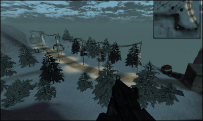
This too still looks daft - partially because of how tall those lampposts are compared to the width of the road, and how they very deliberately alternate left-right across each side. It’s very artificial. When placing stuff like this down it’s important to remember that humans are lazy - we do things in the quickest, most basic way that we can get away with. It might be pretty to have them alternating, but it also looks very unnatural.
I also like how this mini-road has dashed lines along the middle despite clearly only wide enough to take one vehicle.
I still think it needs more cover too, like a little structure near the middle or maybe an undulation in the road, just so there’s some sort of cover. Not knowing how the game is meant to play that might be totally ill-fitting, but that’s just my assumption.
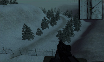
I don’t know what to say about this one. Same as above, I suppose - there’s not a lot to it besides trees and a very clear path going to a dodgy, weak-looking fence. The scope of the path doesn’t match up well with the scope of the broken fence area. The hillsides are very flat (it needs bits jutting out, and alcoves, and things like that.) The industrial-esque is resting on the snow rather than being partially buried; it doesn’t fit with the environment. I’d expect something a lot sturdier, a lot more overbearing, and with a clearer, larger breach in the centre.
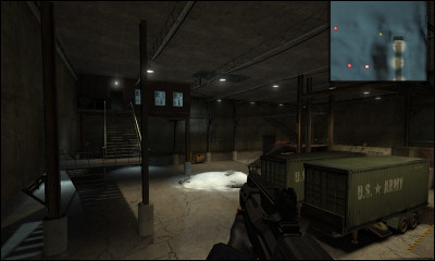
This section hasn’t changed much from last time. It’s got a heap of snow, presumably from the square hole in the roof, but that’s all I can really make out. It’s still a bit sparse and grey though. In cases like this, the only solution is to add disco lights. Everywhere. Every room. Around every corner. Proper, flashing disco lights. Also, music by the Beegees. That’ll fix it. That always fixes everything.
So ol_bunker has improved a bit, but I’m still not happy. Fortunately Lord uNsaIN The Second knows better than to listen to me.
My quest to destroy each and every designer’s self-confidence continues. Ho ho ho (hum).


