Well, it’s Saturday 4th February, and as everyone knows, Saturday 4th February means I have to post some screenshots. It’s the law.
So, here you go. A bunch of screenshots from my Counter-Strike: Source ‘remake’ of pa_fact. It’s still not finished. There’s still some way to go. The ‘building’ route from the original doesn’t exist yet, but as of today the ‘archway’ bit does. The inside of the building is near completion, as is the front (CT-side) of the building. Lighting still needs a good kick in the teeth before it’ll be finished.
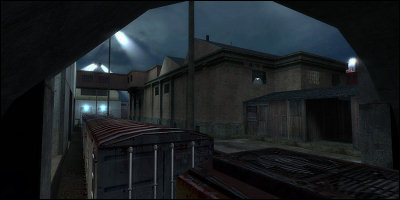
This shows the CT side of the big anonymous building and a couple of ventilation entrances on the side. I’ve had to opt for using a railway track this side, since the street in the original seemed a bit lost… thich signifies quite a big change. We now have a large area offering significantly more cover than before. I may well remove some of this cover to focus more of the combat elsewhere.
I haven’t actually got the ventilation entrance finished yet; the room is there, I just need to connect it to the outside world without it looking daft. The bright, glaring lights above the track will go, they’re completely out of place here. The area still looks pretty flat.
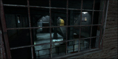
The window of despair, looking straight into the internals of the building. It’s very, very dark in there in some spots - decided to go for a lot of contrast to make spotting Terrorists a lot harder than it was in the original. The colour of the lights is going to change - although I think the blue looks pretty nice, everyone knows incadescent lighting should give off much warmer, yellow tones. There’s also a chance the windows will be blocked off if I can’t get the visibility sorted, but that’s not a biggie at all.
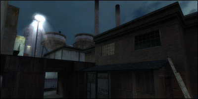
This is the bit that has been giving me nightmares. I just couldn’t find a good solution for what was originally a random platform around the back yard. It’s now just a solitary shed-like platform that still doesn’t quite sit right but gets the job done. Could easily change. Still needs a lighting pass and a whole heap of dirt- and junk-ification.
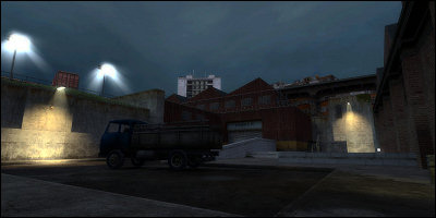
The Terrorist-side backyard. Same general idea as in the original map, but a bit uglier. I still need to work on this area, it’s really quite bland right now and the lighting isn’t helping any!
The skybox isn’t looking too good in that last screenshot either. Hello big grey building!
So to conclude: it’s not done yet. It’s still ugly. The JPEG compression setting I used is rubbish. I made up some law for the purpose of writing an intro. Showing pretty dull, unfinished map screenshots feels about as unnverving as a Scotsman leaving his house without his kilt.
Wizard.


