One of my favourite things about HL2, one of the things that set it apart from so many other FPS’s, is the lighting. It managed to remain realistic (more so than most games), but also engaged the “wow, we can do real shadows!” era of Quake, where strong, well-defined shadows were cast everywhere. HL2 is awash with spotlights and bold colours combined with otherwise casual lighting.
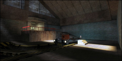
Of course, the first HL1 got the lighting right too. One of my favourite scenes is at the end of the training section, when you come to a small flatbed train in a large, dark room lit only by the light from the windows.

I remember getting to that room, having played the training, and feeling warm. You know the lighting is right when you can feel aspects that you shouldn’t (since you’re actually limited to just the screen and sound.)
Ambience is something that is very powerful when done right. Even if the player only feels it the first time they play, it’s something they’ll associate with the map and remember for a long time. HL1’s boot_camp still reminds me of a warm, clear Sunday morning simply because that’s what it felt like when I first played it, and that makes it all the more engaging.
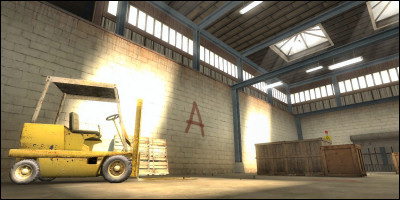
What got me babbling on about this? Well, Nuke, of course:

First time I saw that room I felt warm, again (yeah, again.) The brilliant, harsh sunlight brings a lot to a room that is otherwise fairly empty. It could have been populated with a hundred props and details, but it would have been wasted compared to this.
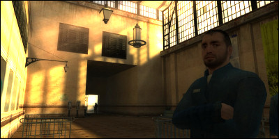
…of course, just to complete this post, here’s a screenshot from HL2:

Not quite as effective as in Nuke, but I like taking these screenshots, so there.
So I guess the moral of this post is: lighting rocks when done right. Do it right. Bye!