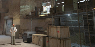
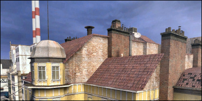
The past year or so has been a great time for level design aesthetics: finally, adding purely aesthetic, non-gameplay elements to maps is affordable. Horizons are littered with trees. Birds fly through the air. Discarded drink cartons roll across pathways. Dead, lifeless structures are cornered by life and activity, as boring and casual as it seems.
Of course, this has been particularly true in Source-based games. HL2, HL2DM, CS:S, and soon DoD:S all seem like they’re living, breathing places, simply because of the details and elements that play no active role in the game, but rather draw us in further.

How’s it achieved? Well, through several means. It is not just about adding bottles and barrels everywhere (as seems to be the assumption judging from some of the maps I’ve played), nor is it about adding even more detail to existing structures like door frames and 40-sided pillars. In fact, relying on hundreds of cans and barrels usually leads to a more artificial, mass-produced appearance than one would expect (repetition).
The key to making maps look real is to trick the brain of the player/user. The user’s brain knows its playing a game. It knows that the environment in which the game takes place has been designed to particular specifications, to meet particular goals. Because developers have complete control over this, they could make a perfect map with a pure focus on gameplay. However, that isn’t ‘real’.
The key to making a map look real, therefore, is to add flaws. Or rather, disturbances that suggest that the environment was grown rather than engineered and designed.
Look at a modern city or a town - it didn’t just all appear at the same time, it grew from nothing, and will have changed and evoloved. Buildings will have been destroyed or extended. Compromises will have been made. Things will have been forced into place, forced to adapt. There will be inconsistencies. There are mistakes. There will also be rubbish, litter, dirt, grime and tidyness as the icing.

Most importantly though, these details and inconsistencies must be subtle. They must not draw attention. They are the things you see in a map and ignore but accept. They are things where purpose is clear, but reasoning is not.
The hacky way to add this to an existing map is to hack bits out and hack bits in. Disturb patterns, cut out holes and fill them with junk. Consider how people would have lived. Consider the punishment and the adaption that would have occurred. Add the physical stuff and features that you would not mention in a verbal description of the area.
The key is to not overdo it, and not underdo it. The players attention should be directed at the gameplay, not anything else. As always, subtlety is key, but nothing at all is even worse. It’s difficult to achieve, but always worth it.