Since dumping Battlefield 2 due to its bugs and irritations, I’ve started playing CS:S more. The other day I hopped onto a server, but the map ended pretty soon and suddenly a new one was downloading. I rarely have the patience to let a new map download (I usually stick to the official maps), but this time I thought I’d give it a chance, just for a change of scenery.
The map I got wasn’t terrific, but it wasn’t awful either (after all, it had made the rotation of a reputable server so it couldn’t be all bad). What struck out at me however were some design features that I found quite unique and interesting; the sorts of things that I would never have thought of. It also has some common errors that could have easily been remedied (and represent a strange variation in quality throughout the map).
So, ‘de_view_update1’ then…
I like: the lookout
By far my favourite feature of the map is a small bunker that sits atop a hill giving a nice, wide view of the map surface. It’s not a great view, but generous enough to give a sniper some good opportunities, whilst also giving the defending team plenty of room to either find cover, take another route, or take out the sniper. It’s neat in that it’s not overpowering (snipers won’t rush to it every round), but the occasional time that it is manned, it will cause the CTs a few problems if they’re not careful.
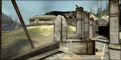
…and as an added bonus, I think it looks pretty neat too.
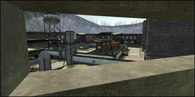
I like: bombsite B
Well, actually… I’m not a fan of the presentation of bombsite B or how it fits in. It’s basically an oversized board room underneath the ground with a large set of windows on the roof that basically define the street. In that respect, it doesn’t work. This sort of configuration has been used in other maps, but I’ve never seen it work well.
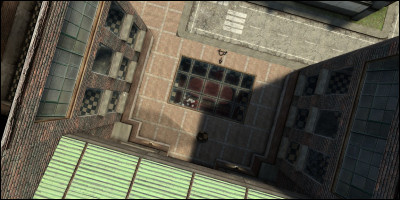
This bombsite however has two buildings either side, with lots of windows and a big view area into the bombsite below, such that the bombsite can be guarded from high above. The important thing here is that suddenly the room below doesn’t feel as safe as it would have done; there is always the chance a CT sniper is in one of those buildings and will snipe you as soon as you try to plant the C4 on the table. Similarly, to get a good view into the bombsite as a CT, you expose yourself to any Terrorists on the surface.
There are also some interesting changes of gameplay dynamics to this area when the C4 is planted…
I like: this bit
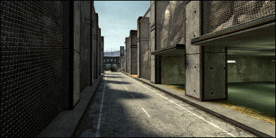
I just think it looks quite nice.
I don’t like: the flow
The worst bit of any map is playing it for the very first time, not knowing what to do or where to go. A map with good flow will guide you into the right direction, either through excess use of signs, or subtle hints and good layout.
This map fails in that respect. Playing as a CT I was instantly presented with a plethora of directions and routes to take, but I opted for the safe option of hanging back and moving with the pack. I’m sure all the routes would have taken me to roughly the right spots, but that doesn’t make for interesting gameplay if everyone is segregated by taking a different route.
This is where I credit Cliffe for this tip, it’s one of the first things I learnt in mapping for Counter-Strike, and also the most valuable: give teams a couple of main routes, but not a handful.
A couple of places consist of several routes starting in the same spot and ending in the same spot. One is just a building you can go straight through (minding the crates!) OR round to the left (minding the crates!) OR round to the right (minding the crates!) I can cope with that, but I always feel could have been done better.
That reminds me: this map is over its crate quota.
I don’t like: the underground
This is what I don’t understand. The map, itself, looks quite good above-ground, but the underground section is a big black mark. It’s just a big blip in the variation of quality, showing that the designer could have done something so much better, but didn’t.
First of all, it’s underground, and basically a series of tunnels and rooms. That’s a big fat “STOP!” already.
Secondly, it’s dull. Observe as I enchant the powers of coloured pixels to illustrate my point using screenshots:
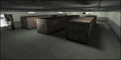
It’s a room, full of crates. A dark room (lightened artificially by me.)
I don’t like: (some of) the texturing work
Beginner’s error really, but any corridor that looks like this is massively ugly and should be destroyed immediately:
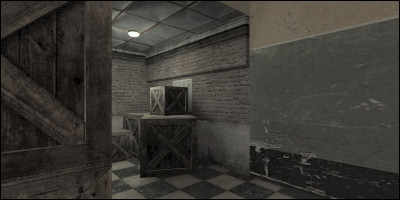
What you see here is a corridor joining the bombsite B room. Note how the texture on the wall instantly changes from brick to plaster, how the floor is checkered tile, and how the brick of the corridor just looks out of place.
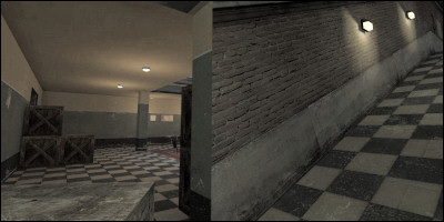
Note that the above shot is not two shots stitched together in the centre - those two textures really do bang into each other like that in the map.
In fact, it all looks out of place. Admittedly, getting things like this takes practise and observation of other maps, but it can be done and it should be done. It needs a proper doorway (doesn’t even need a door, but some sort of structure would be nice) and a better segue between the two styles.
A staircase would be nice too (rather than a ramp); tiled slopes are extremely dangerous when wet.
I don’t like: this room
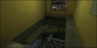
It’s just extremely dull and makes no architectural sense for a map that otherwise does fairly well maintaining a sense of realism.
I also like…
Finally…
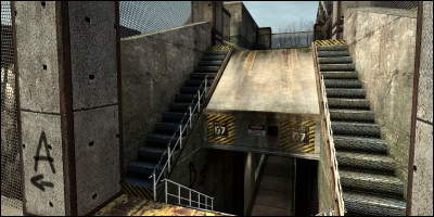
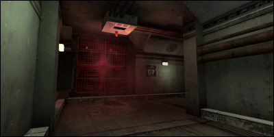
This is what annoys me about this map: some of it is clearly built with skill and a good sense of visual design (see above screenshots), but other bits are totally opposite (see further above) and show sheer ugliness.
There are some important lessons here. Don’t make the same mistakes, but bear in mind what worked.