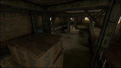
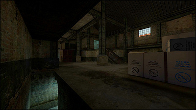
Nothing’s coming to mind to write about, so instead I thought I’d post a couple of screenies of something I did last Sunday and a few of the things in it that I think work quite well.
These screens are from a very quick and rough update of pa_fact, but this time using the Source engine. I thought it was about time to do the conversion, partly because it’s a map I’m fond of, and partly because it suits an engine like Source far better than it ever fitted HL1. I’ve actually only done in the interior and part-exterior of the main building, so that’s all I’m going to show here.
There are a few things I’m trying here. Firstly, I’m trying to make it more interesting by adding a few more interior crannies and hiding places, with the aim of giving the CTs a reason to stay inside and focus on defensive/ambush-style play. At the same time, the lighting has been made a lot bolder, with the building interior very dark and the exterior very bright. Meanwhile, of course I’ve been trying to keep an eye on balance… otherwise I’m giving the whole advantage to the CTs. Then there’s the extraneous stuff, like trying to make the place look real-ish.
Gameplay wise, there are quite a few things to think about. Importantly, the effect of having all the CTs (should only be about 3 or 4 players per tean on a map like this) holed up in the same area, and whether this makes for easy killing by the Terrorists. That’s why I’ve added more nooks and hiding places which really just add cover from the main entrances. Of course, every nook needs a weakness, be it by lack of sight or lack of space. I’m considering adding water outside which will make sound an important factor (as it was in the original).
The lighting has been fun. The intent is that the building is almost entirely lit by sunlight through any open windows, with only a few flourescent lights to brighten up important areas and decrease their value as hiding spots. I was hoping that the radiosity and light bouncing would give the interior enough light, but in the end I still had to fake it. (Old-school technique, basically a few point lights inside with the same hue as the sunlight, but desaturated, very low power of maybe 15 or 20, and a linear fade value of about 0.2). This is the sort of map where HDR would really affect gameplay, so that’s something I’ll try toying with. Bear in mind the shots have had their gamma adjusted; the original is much darker than it appears!
But perhaps my favourite, simple tweak of the map so far has been using overlays to break up the floor. When I first layed it down, it was just a swathe of one texture and the lighting didn’t help much. It’s meant to be some sort of dirty workspace, so I took some stain decals, layed them down, and stretched them right out to give the area much more variety without it looking like I’ve just planted a few decals everywhere. (That’s a new plague by the way - obvious overlay/decal placement for the sake of placing them - you can stretch and rotate overlays so do it if it helps!) You can see the result in both screenshots. Ok, so that’s pretty much what overlays are for, but I didn’t expect them to work that well, especially considering how much I stretched them.
So, that’s pa_fact for CS:S. Not done yet. The exterior is a nightmare. Interior still requires some tweaks. Roof entrance is proving difficult… but that’s what makes it fun.

